Most people who use AI image generators for the first time produce mediocre results — not because the tools are bad, but because writing prompts is a skill that takes practice to develop. The frustrating part is that the same underlying mistakes show up again and again, across different tools and experience levels. Once you know what they are, they're fixable.
This guide covers the 15 most common prompt engineering mistakes, why each one causes problems, and — most importantly — exactly how to fix them. Every mistake includes a before/after prompt comparison so you can see the difference in practice.
Mistake 1: Being Too Vague
The mistake: Writing open-ended prompts that leave too much to the model's interpretation — "a person in a city", "a nice landscape", "a dog", "a beautiful woman".
Why it fails: AI models fill ambiguity with averages. Ask for "a person in a city" and you'll get the most statistically average person the model knows, in the most generic city it knows, in the most average composition. The result is technically correct but creatively empty.
The fix: Specificity is the most powerful lever in prompt engineering. Who is this person? What do they look like? What are they doing? What city, what time of day, what weather, what camera angle? Every detail you add collapses the probability space toward something interesting.
| Weak | Strong |
|---|---|
| a person in a city | young Japanese woman in her 30s, wearing a yellow rain jacket, waiting at a crosswalk in Tokyo during heavy rain, neon signs reflecting on wet pavement, street photography, f/1.8 shallow depth of field |
| a nice landscape | golden hour over the Scottish Highlands, dramatic storm clouds breaking to reveal shafts of orange light over rolling heather moorland, ancient stone wall in the foreground, wide angle landscape photography, high detail |
Mistake 2: Using the Wrong Prompt Syntax for the Model
The mistake: Writing Midjourney-style prompts with parameters like --ar 16:9 --v 6.1 and pasting them into Flux or Stable Diffusion. Or writing long flowing sentences that work in DALL·E and using them in SD without adapting.
Why it fails: Each model has its own syntax. Midjourney uses --parameter value flags. Stable Diffusion works best with comma-separated tags and has its own weighting syntax. Flux and DALL·E both understand natural language but process it differently. Syntax from the wrong model either gets ignored or actively confuses the generator.
Model syntax guide:
| Model | Best Prompt Format | Parameters Syntax |
|---|---|---|
| Midjourney | Natural language or tags | --ar 16:9 --v 6.1 --style raw |
| Stable Diffusion | Comma-separated tags | Separate negative prompt field; (word:1.3) weighting |
| Flux | Natural descriptive sentences | No special parameters; descriptive language |
| DALL·E 3 | Natural language instructions | No parameters; conversational style works |
| Ideogram | Natural language; quoted text for rendering | Style/magic prompt toggles in UI |
The fix: Before pasting any prompt into a new model, strip out model-specific syntax and reformat for the target tool. A prompt extractor tool can help you get the core description from any image so you can rewrite it for your target model.
Mistake 3: Overloading the Prompt with Too Many Concepts
The mistake: Cramming every interesting idea you have into a single prompt — "a cyberpunk samurai riding a dragon through a neon Tokyo rainstorm while fighting robots next to a cherry blossom waterfall with a moon in the background".
Why it fails: AI models have a limited capacity to balance competing concepts. When you give it 8 distinct ideas, it will try to average them all or pick the ones that dominate its training distribution. The result is visual chaos — elements merged nonsensically or some concepts simply ignored.
The fix: Choose one primary subject, one environment, and one mood. Everything else is supporting detail for those three things. If you have many ideas, make multiple images — one per focused concept — rather than one overloaded image.
| Overloaded | Focused |
|---|---|
| cyberpunk samurai on a dragon in rainy Tokyo fighting robots near cherry blossoms with a full moon | cyberpunk samurai standing in rain-soaked neon-lit Tokyo alley, cherry blossom petals drifting past glowing advertisements, cinematic composition, dramatic rim lighting |
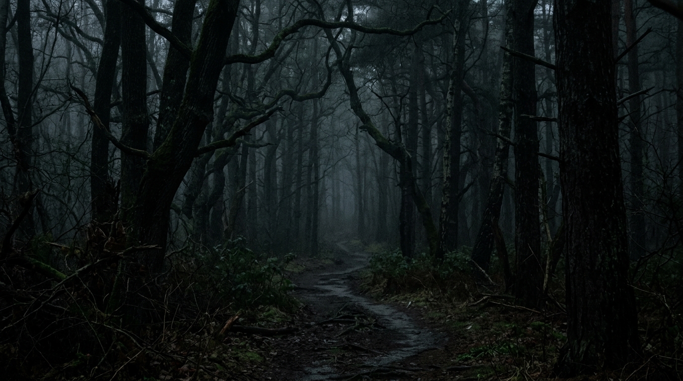
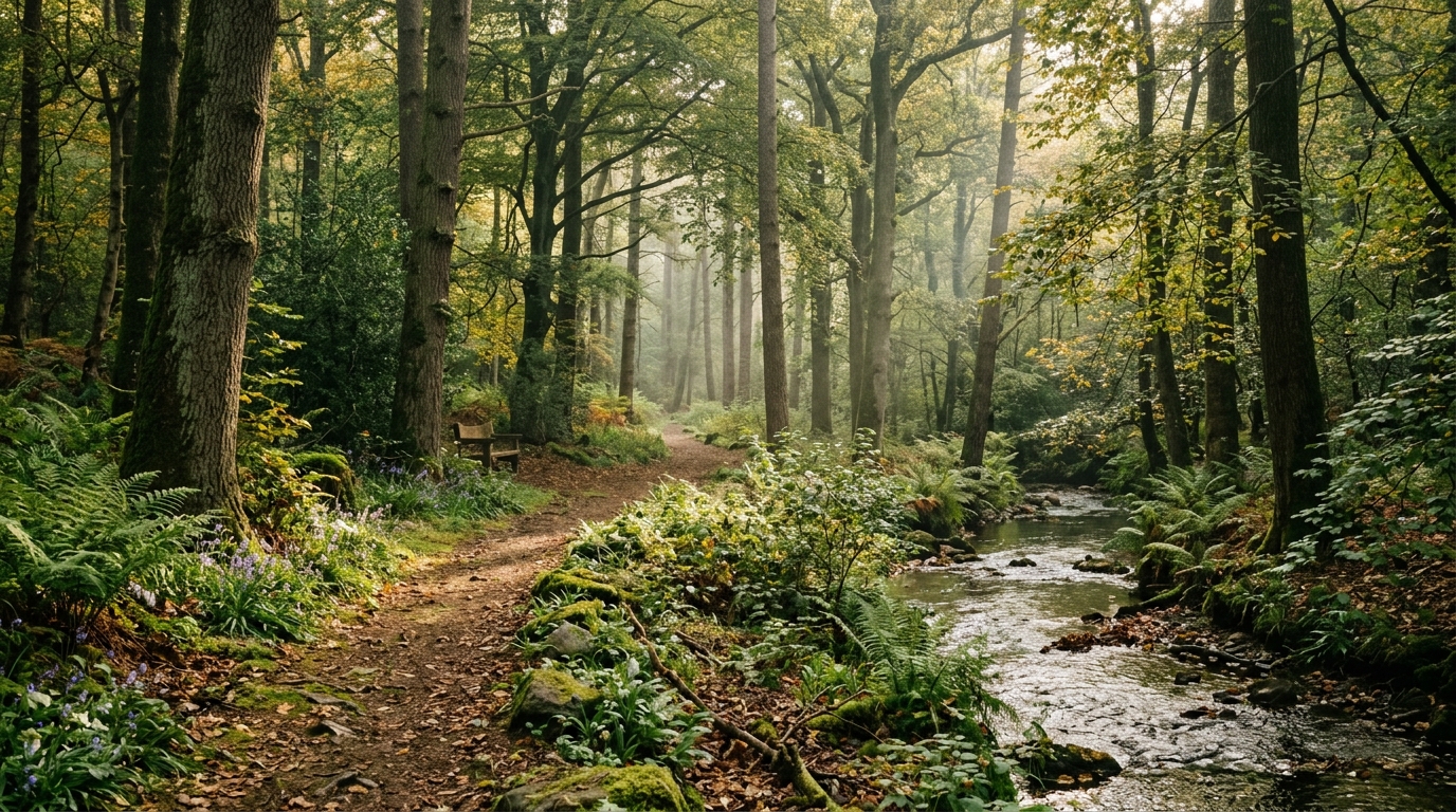
Mistake 4: Forgetting About Lighting
The mistake: Describing every element of a scene — subject, environment, style — but saying nothing about the lighting.
Why it fails: Lighting is what transforms a technically correct image into a striking one. Without lighting instruction, the AI defaults to flat, generic studio lighting that makes even the most interesting subject look boring. Lighting creates mood, directs attention, and defines the atmosphere of an image more than almost any other single variable.
The fix: Always include at least one lighting descriptor. Choose from these high-impact options:
- Time of day: golden hour, blue hour, midday harsh sun, pre-dawn
- Source: natural window light, backlit, candlelit, neon sign lighting, bioluminescent
- Quality: dramatic chiaroscuro, soft diffused, harsh direct, dappled through leaves, volumetric god rays
- Color temperature: warm amber glow, cool blue moonlight, orange fire light, clinical white fluorescent
| Without lighting | With lighting |
|---|---|
| ancient castle in a forest | ancient castle in a dense forest, golden hour light breaking through storm clouds, shafts of light illuminating misty ground, dramatic and atmospheric |
Mistake 5: Ignoring Aspect Ratio and Composition Guidance
The mistake: Always generating in square format regardless of what you're creating, and never mentioning composition (camera angle, framing, perspective).
Why it fails: A portrait photo needs a vertical format. A landscape scene needs horizontal. A YouTube thumbnail needs 16:9. Generating in the wrong aspect ratio forces the AI to make compositional compromises that degrade the result. Similarly, without composition guidance, the AI defaults to a centered, head-on "average" composition.
The fix: Specify format and composition in every prompt:
- Aspect ratio:
--ar 16:9(MJ),landscape format,vertical portrait orientation - Camera angle: overhead bird's eye view, low angle worm's eye view, eye level, Dutch tilt
- Framing: extreme close-up, medium shot, wide establishing shot, rule of thirds composition
- Lens: wide angle, telephoto compressed perspective, fisheye, macro
Mistake 6: Not Using Negative Prompts in Stable Diffusion
The mistake: Using Stable Diffusion without a negative prompt, or using one that's so short it does nothing.
Why it fails: SD models have persistent tendencies toward certain artifacts — deformed hands, extra fingers, blurry faces, watermarks, low quality textures. Without a negative prompt pushing against these tendencies, you'll fight them every generation.
The fix: Use a comprehensive standard negative prompt as your baseline, then add subject-specific exclusions:
Standard negative: ugly, deformed, noisy, blurry, distorted, out of focus, bad anatomy, extra limbs, poorly drawn hands, poorly drawn face, mutation, watermark, signature, text, logo, oversaturated, jpeg artifacts, low quality, worst quality, lowres

Add for portraits: asymmetric eyes, crossed eyes, bad teeth, skin texture issues

Add for environments: people (if unwanted), cars (if anachronistic)

Add for product shots: reflections (if unwanted), background cluttermasterpiece, best quality, highly detailed) combined with quality exclusions in the negative. Older SD 1.5 models rely more heavily on negative prompts alone.
Mistake 7: Using Outdated Model Parameters
The mistake: Running --v 4 in Midjourney when v6.1 is available, or using SD 1.5 checkpoints when SDXL offers dramatically better quality for the same effort.
Why it fails: Model versions represent significant quality jumps. Midjourney v4 vs v6.1 is not a minor difference — v6.1 produces substantially more coherent anatomy, better prompt adherence, and higher visual quality. Running old versions because "that's what the tutorial used" leaves significant quality on the table.
The fix: Check what the current recommended version is for your tool before each project. For Midjourney in 2026, set --v 6.1 or use /settings to make it default. For Stable Diffusion, prefer SDXL-based checkpoints over SD 1.5 for new work unless you have a specific reason to use older models.
Mistake 8: Copying Prompts Without Adapting Them
The mistake: Copying a prompt from Reddit, PromptHero, or another community site and running it unchanged, then being confused when the result doesn't match the example image.
Why it fails: Shared prompts are tied to specific models, versions, seeds, and settings. The same prompt on a different model version, with different sampler settings, or with a different seed will produce a different image. Additionally, popular shared prompts often include custom model trigger words or LoRA references that don't apply to your setup.
The fix: Use shared prompts as a starting point, not a recipe. Extract the style and structural elements that make it work, understand why those elements work, and rewrite the prompt for your exact tool and use case. Think of it as studying someone's technique, not photocopying their work.
Mistake 9: Not Specifying a Medium or Rendering Style
The mistake: Describing what to show but not how to render it — leaving the model to guess whether you want a photograph, a digital illustration, an oil painting, or a 3D render.
Why it fails: Without medium specification, AI models default to whatever rendering style is most common in their training data for that subject — which is usually a generic digital illustration or photo hybrid that belongs fully to neither category.
The fix: Always specify a medium. Choose one that fits your use case:
| Medium Descriptor | What It Produces |
|---|---|
| photorealistic, DSLR photography, f/2.8 | Photo-quality image with camera characteristics |
| digital concept art, artstation quality | Professional illustration style seen on portfolio sites |
| oil painting, impasto texture | Traditional painted look with visible brushwork |
| watercolor illustration, loose brushstrokes | Soft, translucent painted style |
| 3D render, octane render, subsurface scattering | CG-rendered look with ray-traced lighting |
| ink illustration, pen and ink, crosshatching | Black and white or limited color line art |
| flat vector illustration, minimal | Clean, geometric, icon-adjacent style |
Mistake 10: Using Conflicting Descriptors
The mistake: Combining style descriptors that are mutually exclusive or aesthetically incompatible — "cinematic photography AND flat design AND watercolor illustration".
Why it fails: The model tries to satisfy all instructions simultaneously. Cinematic implies photorealism. Flat design implies geometric abstraction. Watercolor implies traditional painting. Each pulls in a different direction and the result satisfies none of them well.
The fix: Pick one visual register and stay in it. If you want to combine styles, be intentional and specific about the fusion: "watercolor illustration with a cinematic color palette and moody atmospheric lighting" is coherent because it specifies a clear medium (watercolor) with stylistic influences applied to it.
| Conflicting | Coherent Fusion |
|---|---|
| cinematic photography, flat design, watercolor | watercolor illustration with cinematic composition and dramatic atmospheric lighting — keep the medium clear, apply style elements to it |
Mistake 11: Over-Weighting in Stable Diffusion
The mistake: Using excessive attention weighting like (subject:2.5) or ((((beautiful)))) to force emphasis on an element.
Why it fails: Weights above 1.3-1.5 in most SD models cause visual artifacts — the weighted element becomes oversaturated, distorted, or rendered in a way that breaks coherence with the rest of the image. "Beautiful" repeated four times in parentheses doesn't make something more beautiful; it makes the model distort toward its idea of beauty until it breaks.
The fix: Keep weights between 0.8 and 1.3 for minor adjustments. For emphasis, use descriptive language rather than weight values — "strikingly beautiful" is more effective than (beautiful:2.0) because it gives the model more semantic signal rather than just raw attention weight.
Instead of: (beautiful woman:2.0), (detailed face:1.8), ((perfect eyes:2.5))
Use: portrait of a strikingly beautiful woman, perfectly proportioned features, detailed realistic eyes, professional portrait photography
Mistake 12: Forgetting Quality Tokens in Stable Diffusion
The mistake: Writing a detailed subject description but omitting quality signals entirely in SD prompts.
Why it fails: SD models were trained on images tagged with quality metadata. Tokens like "masterpiece", "best quality", "highly detailed", "8k", and "sharp focus" steer the model toward the high-quality examples from its training set. Without them, the model samples from across its entire training distribution — which includes a lot of mediocre content.
The fix: Begin or end every Stable Diffusion prompt with quality anchors:
masterpiece, best quality, highly detailed, sharp focus, 8k uhd, [your actual prompt here]For portraits specifically, add: photorealistic, skin texture detail, professional photography
Note: This technique is most important for older SD 1.5 models. SDXL and later models are less dependent on quality tokens but still benefit from them.
Mistake 13: Using Celebrity or Brand Names
The mistake: Prompting with "a portrait of [specific celebrity]" or "generate a Nike logo" or "in the style of [living artist's name]".
Why it fails: This creates two problems. First, content filtering — most commercial AI tools will decline or produce degraded results for named celebrity likenesses. Second, inconsistency — even when the filter doesn't block it, the model's representation of a named person is often composite and inconsistent between generations.
The fix: Describe the visual characteristics rather than the name. Instead of "a portrait of [celebrity]", describe their distinguishing features: hair color and texture, eye shape, facial structure, approximate age. This produces more consistent results and avoids content filtering entirely.
| Problematic | Better |
|---|---|
| portrait of [celebrity name] | portrait of a woman in her 40s with auburn wavy shoulder-length hair, strong jaw, warm brown eyes, charismatic expression, Hollywood lighting, editorial photography |
Mistake 14: Giving Up After One Failed Attempt
The mistake: Submitting one prompt, seeing a result that doesn't match the mental image, and concluding either that the tool is bad or that the desired output is impossible.
Why it fails: Professional AI artists rarely get their best work on the first generation. The first output is diagnostic — it tells you what the model understood from your prompt and where it diverged from your intention. A bad first result is data, not failure.
The fix: Develop an iteration practice. After each generation:
- Identify the specific element(s) that are wrong (composition? lighting? subject appearance? style?)
- Change one thing in the prompt to address that specific issue
- Regenerate and compare
- Repeat until the output matches the vision
Most experienced AI artists spend 10-30 iterations on a prompt before reaching a final result they're satisfied with. Budget for this in your workflow.
Mistake 15: Ignoring the Model's Native Strengths
The mistake: Trying to generate text-heavy graphics in Midjourney, photorealistic product photography in DALL·E 3, or anime character designs in Flux — using a tool for use cases where it's genuinely weak.
Why it fails: Every model has real strengths and real weaknesses that aren't just marketing. Midjourney excels at artistic, editorial, atmospheric imagery but struggles with accurate text and precise technical outputs. DALL·E 3 is good at following compositional instructions but its aesthetic defaults to clean/commercial. Flux is outstanding for photorealism but less compelling for stylized art. Ideogram is the only reliable choice for text-in-image work.
Model-to-use-case matching guide:
| Use Case | Best Model | Avoid |
|---|---|---|
| Photorealistic people/environments | Flux 1.1 Pro | Midjourney (stylizes too much) |
| Artistic/editorial illustration | Midjourney v6.1 | DALL·E 3 (too literal) |
| Text in images (posters, logos) | Ideogram 2.0 | Midjourney, Stable Diffusion |
| Game art / concept art | Leonardo AI, Midjourney | DALL·E 3 |
| Anime / manga style | NovelAI, Niji Journey | Flux |
| Following precise instructions | DALL·E 3 | Midjourney |
| Custom fine-tuned styles | Stable Diffusion XL | Any closed-source model |
The fix: Before starting any project, ask: "Which tool is genuinely best suited for this specific output?" If you're not sure, do a quick test generation on two or three tools before committing to one for a longer project. The five minutes spent on that test saves hours of fighting the wrong tool.
Summary: The Prompt Engineering Checklist
Before submitting any prompt, run through this checklist:
- Is the subject specific enough? (Who, what, doing what)
- Have I matched the syntax to my specific model?
- Is the prompt focused on one main idea?
- Have I specified lighting?
- Have I specified aspect ratio and composition?
- Have I set up a negative prompt (for SD/Flux)?
- Am I using the current model version?
- Is this a prompt that will need adaptation from someone else's example?
- Have I specified a medium/rendering style?
- Are my style descriptors coherent with each other?
- Are my attention weights reasonable (below 1.3)?
- Have I included quality tokens (for SD)?
- Am I avoiding celebrity/brand names?
- Am I prepared to iterate on this result?
- Is this use case a genuine strength of the model I'm using?
Fixing even half of these in your current practice will produce noticeably better results immediately. The biggest gains usually come from Mistakes 1 (specificity), 4 (lighting), 9 (medium), and 15 (model-use-case fit). Start there if you want the fastest improvement.